Brand development
Customer: Fuchs & Hoffmann
Year: 2019
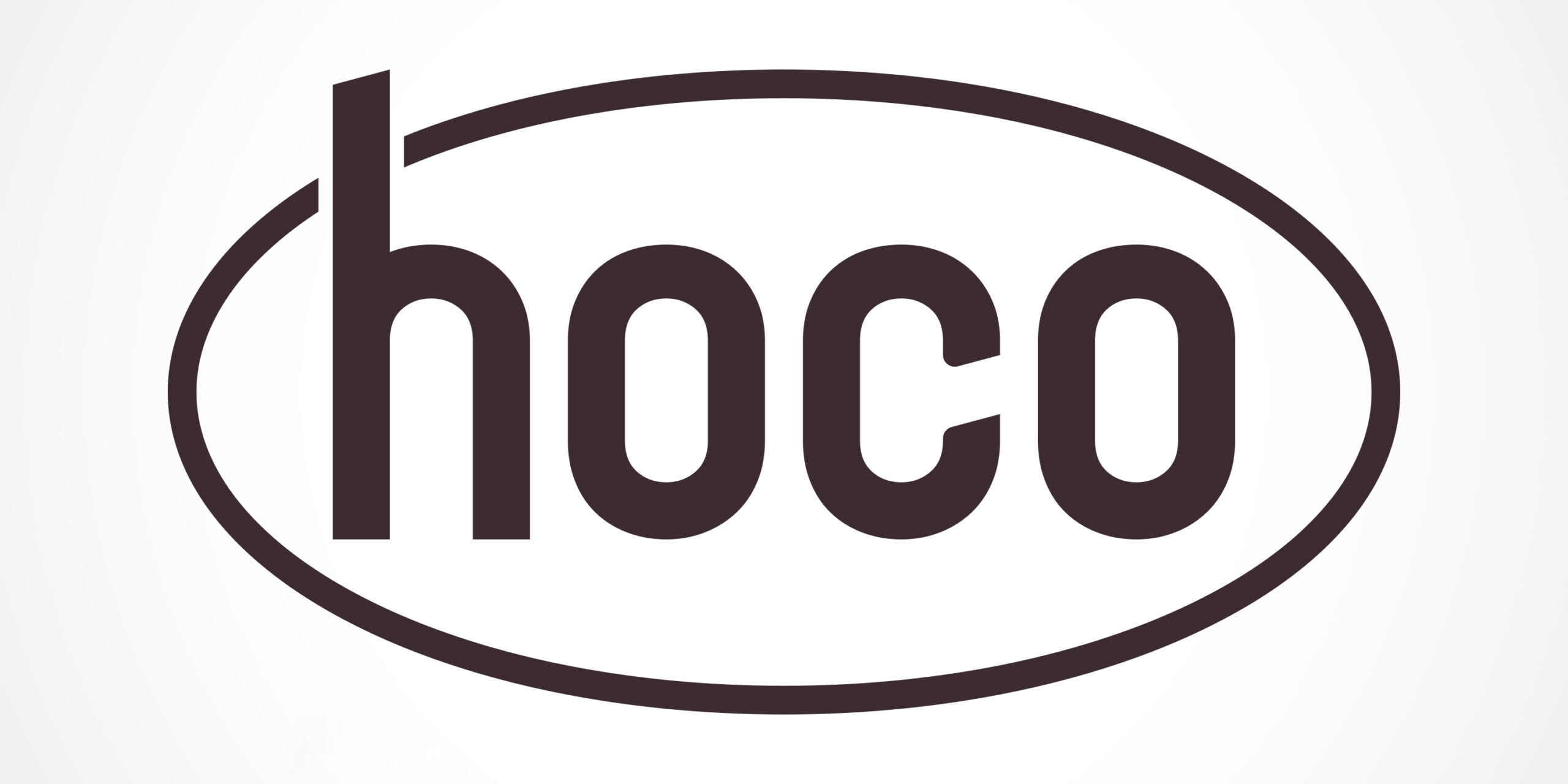
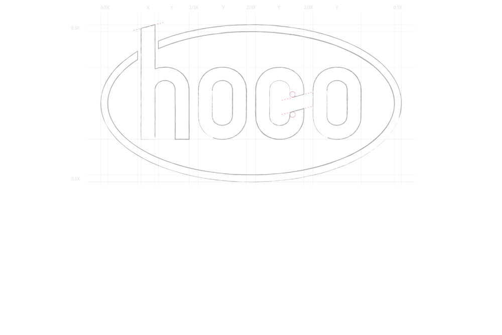
The Hoco logo is a gentle relaunch. The logo has been given a ‘fresh’ and dynamic shape by rounding off the edges and removing the second circle around the word mark. The brown tones – instead of red and yellow – have been deliberately chosen to create an association with cocoa.
