Oldies but Goldies: Goldblume
Brand development
Customer: Metro
Year: 1990
In the early 1990s, Goldblume was one of the most important brands in the German market for dairy products.
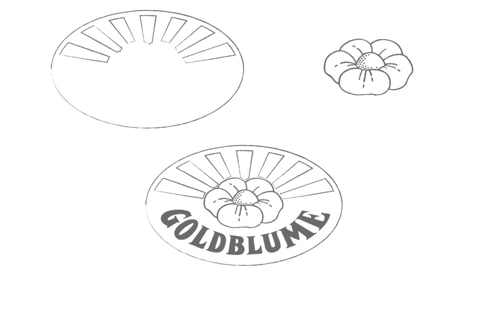
The creation
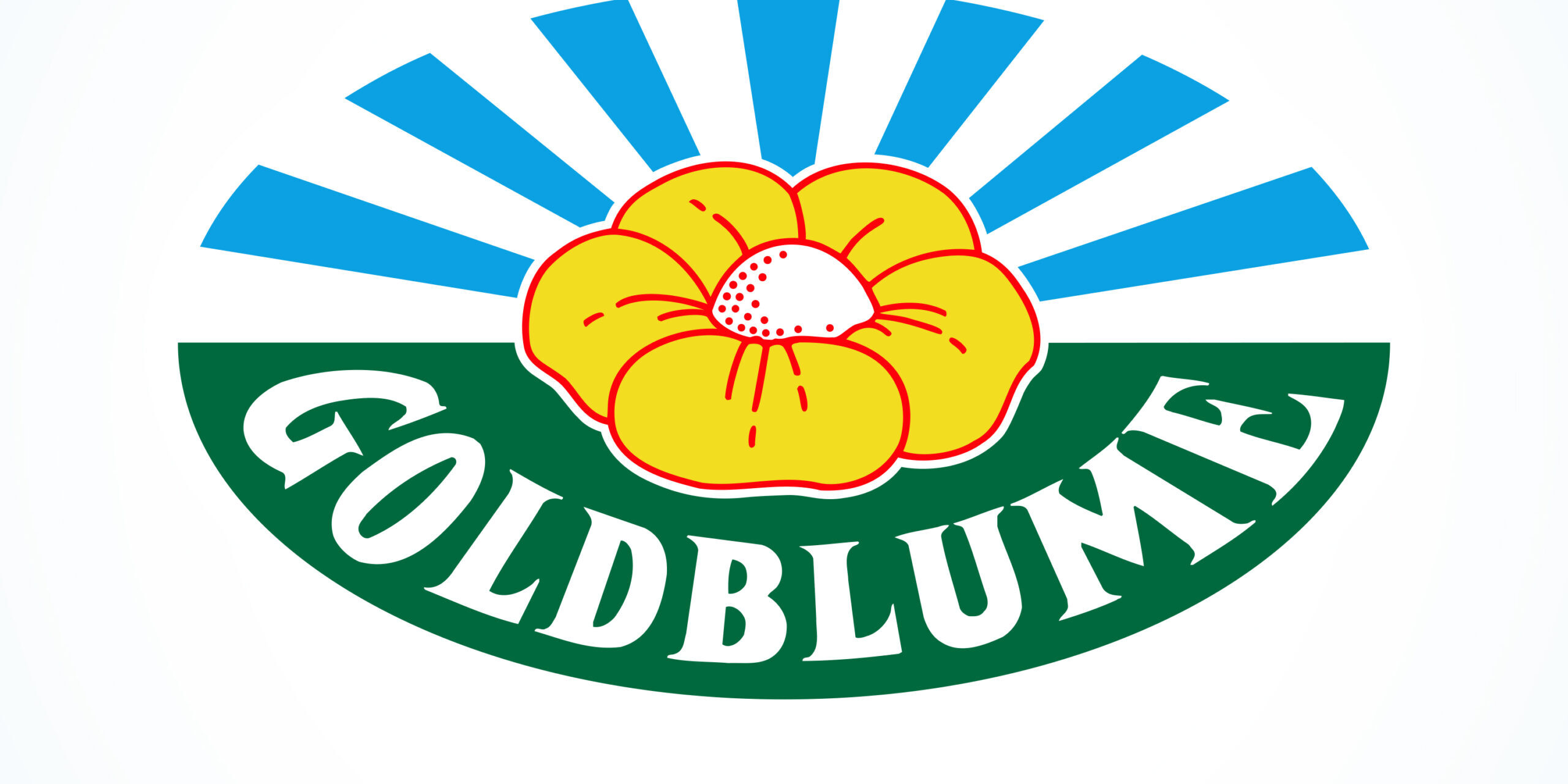
We have deliberately structured the brand in a simple, two-dimensional way in order to do justice to the different qualities of the various printing processes used in the dairy sector, while still guaranteeing a uniform appearance.
Clear, pure colours, strong lines and no gradients guarantee good results in all printing processes.
Please note: At the beginning of the 1990s, printing technology was not up to today’s standards.
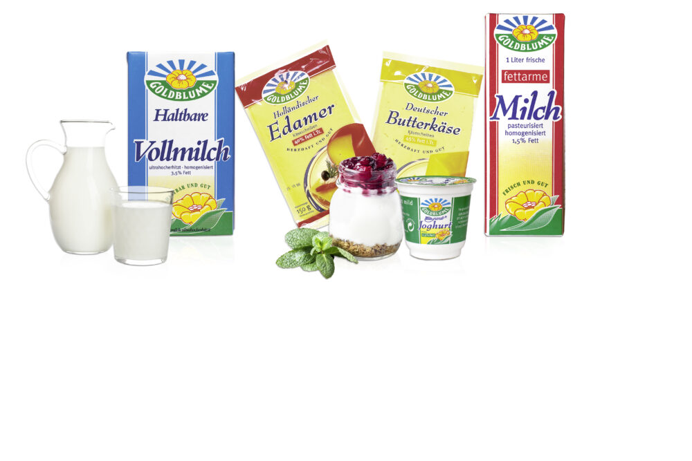
Packaging Design
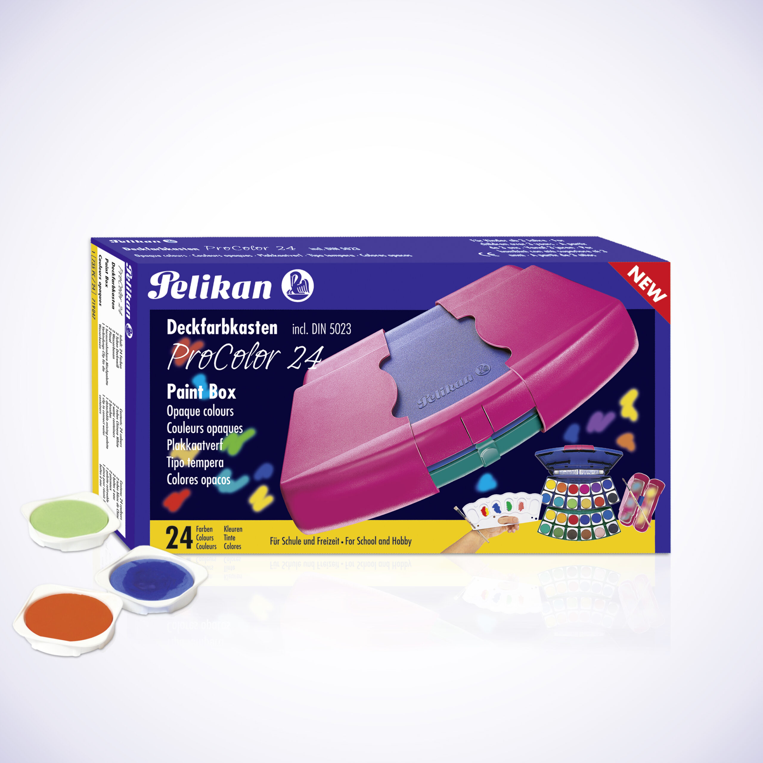
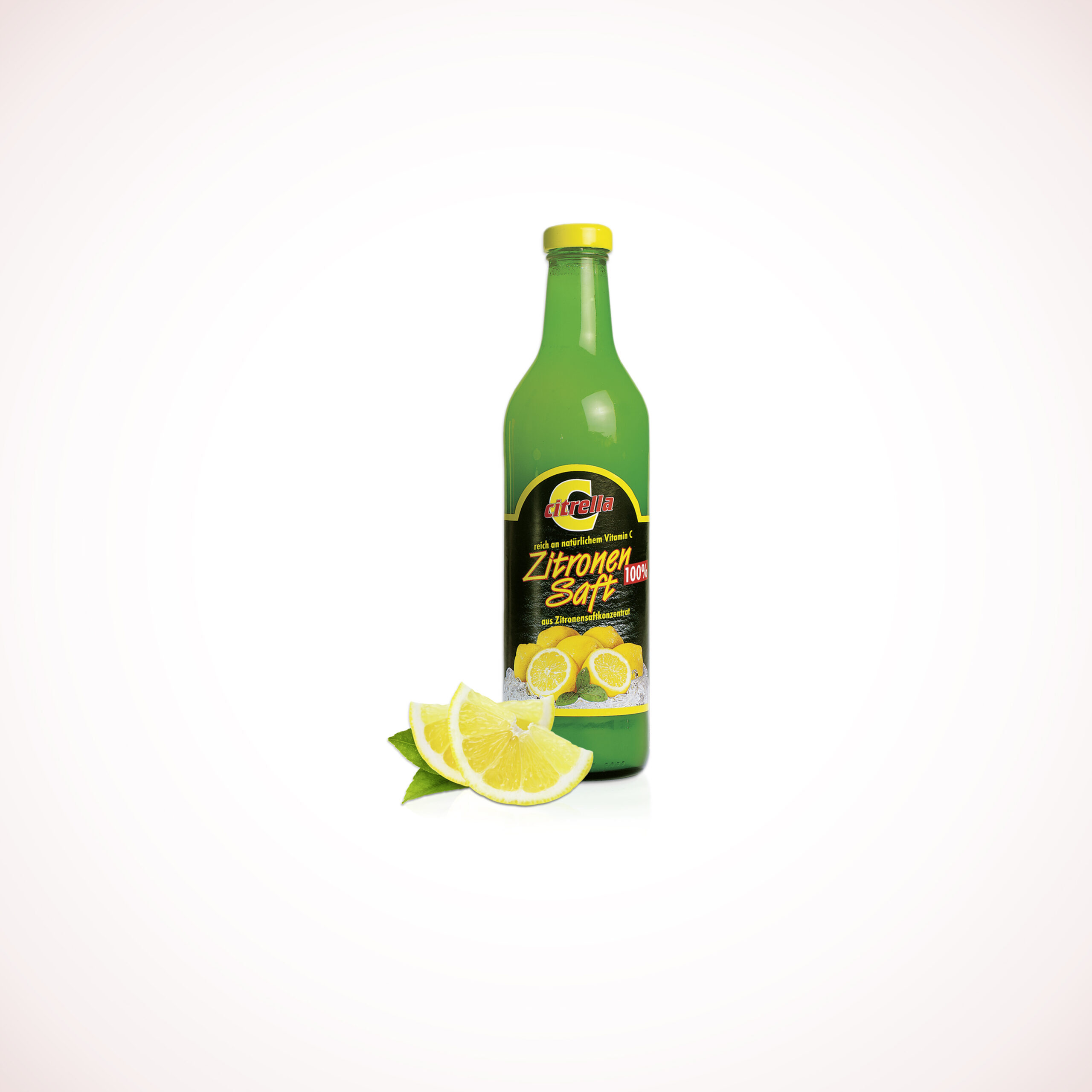
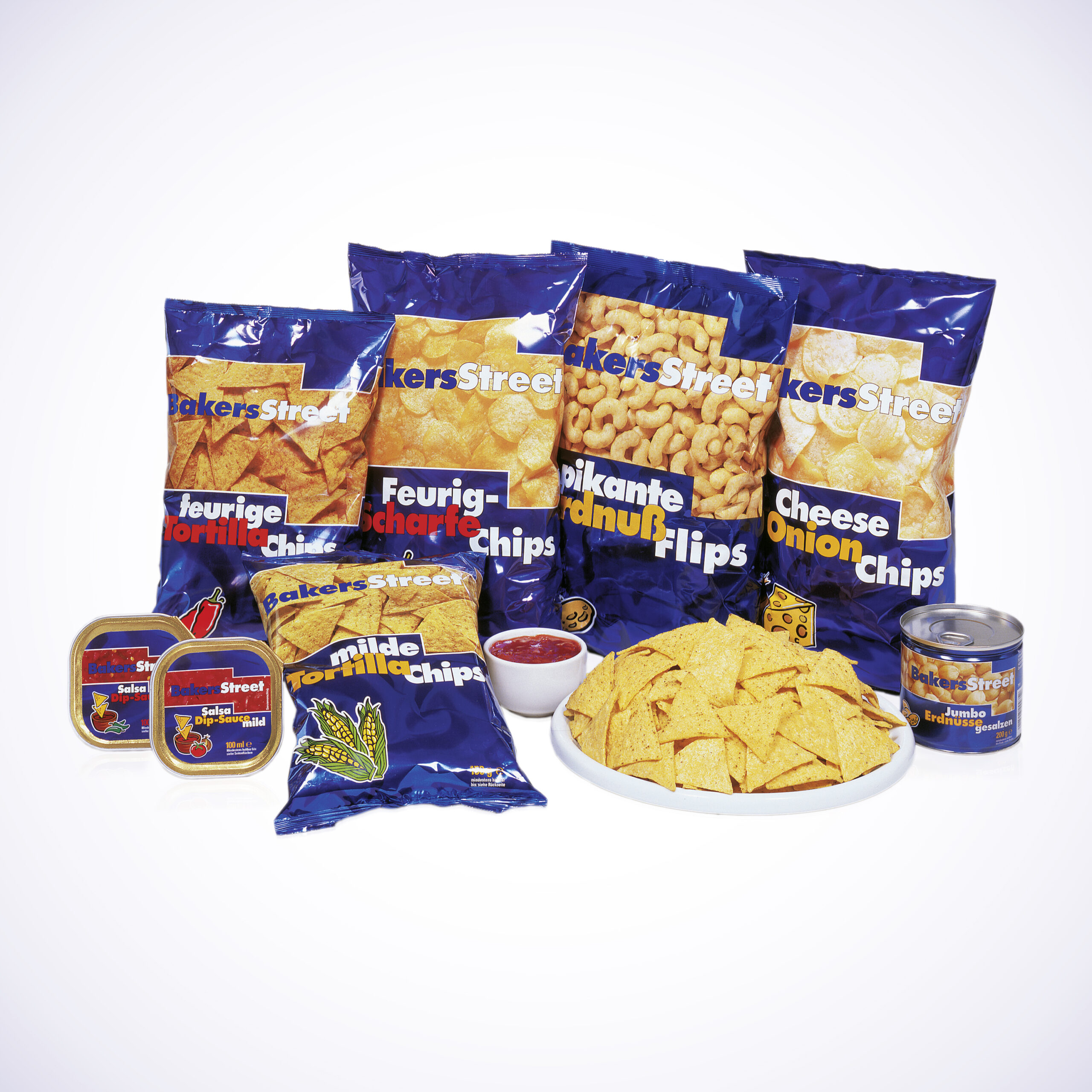
The packaging design for the Goldblume brand enjoys high recognition thanks to its distinctive logo. But it’s not just the logo that is so special. The packaging, designed with a rural look, evokes a homely, familiar feeling among consumers. The products convey honesty and a high level of quality.
