Oldies but Goldies: Schlemmerfix
Brand development
Customer: Metro
Year: 1995
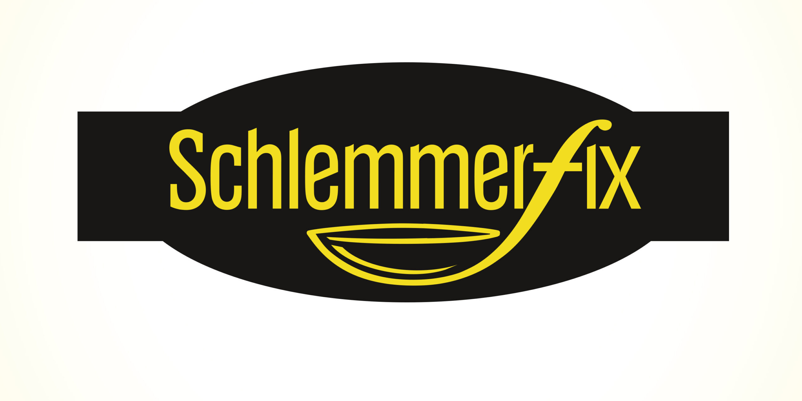
The word/picture mark of ‘Schlemmerfix’ is an excellent constellation of the letter F and a soup ladle.
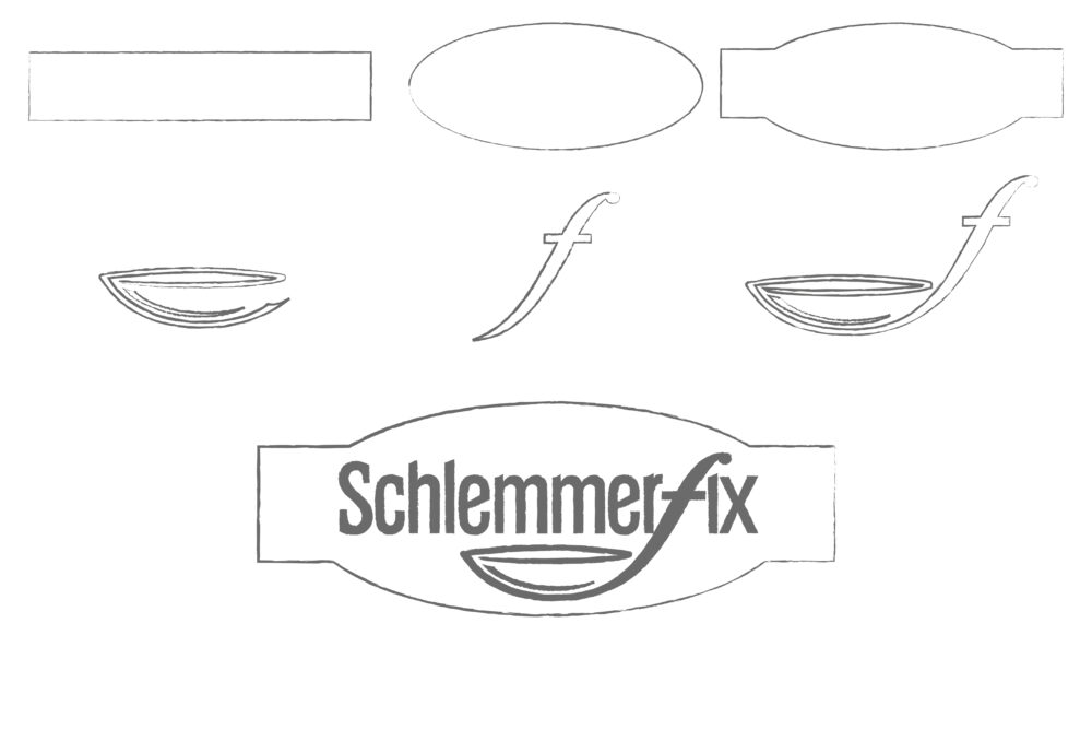
The creation
The soup ladle lets the consumer guess as to which product groups the brand Schlemmerfix represents.
The logo’s colours are limited to a black background with yellow and gold lettering, making the lettering stand out better.
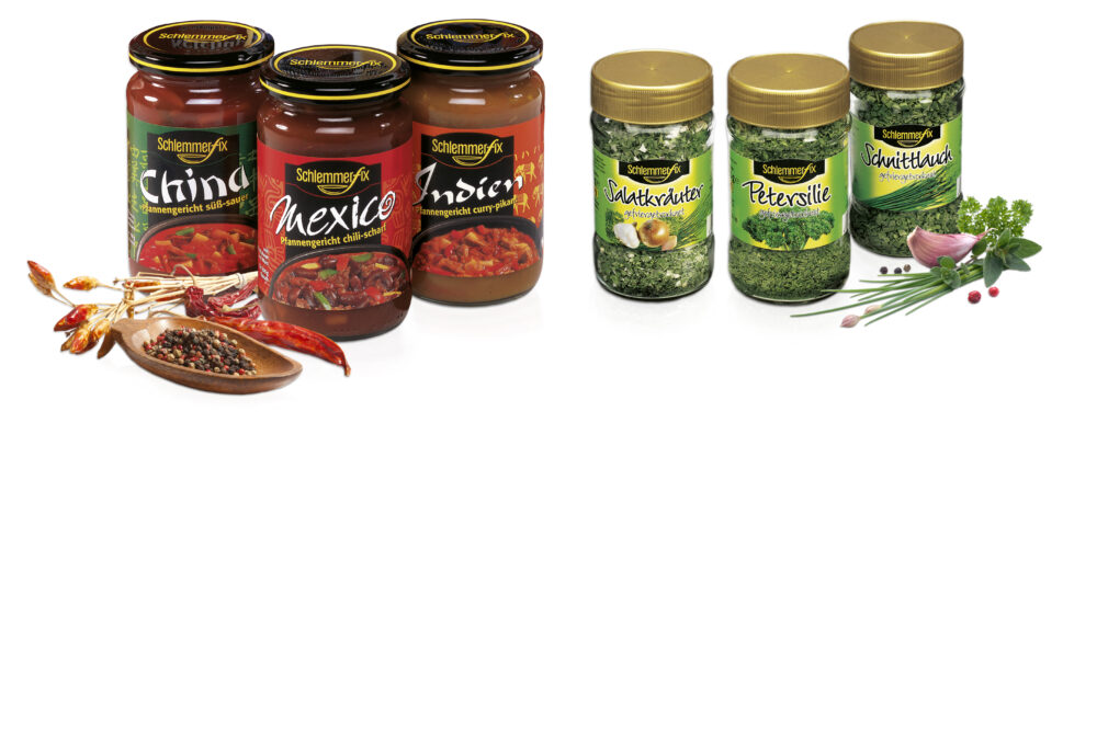
Packaging Design
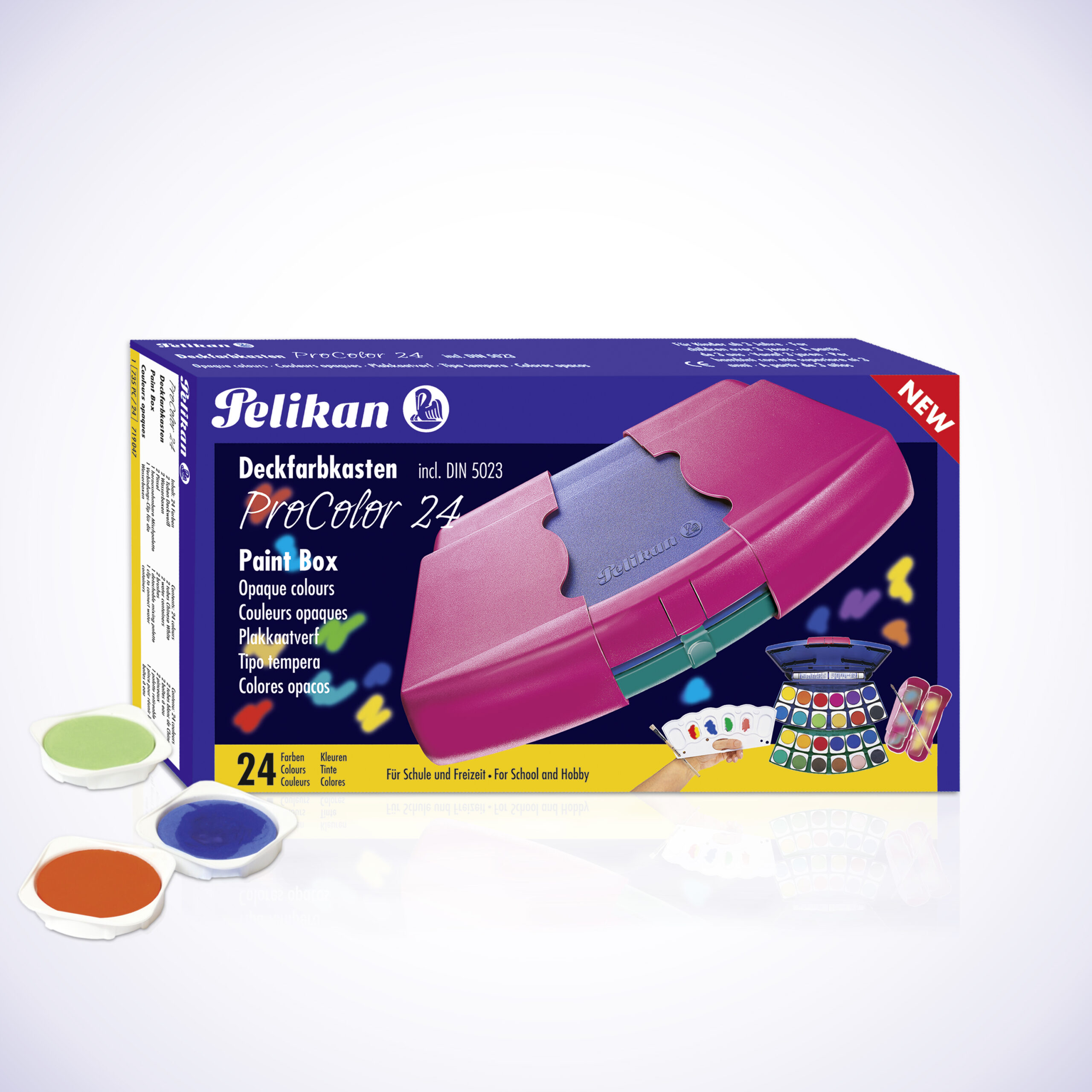
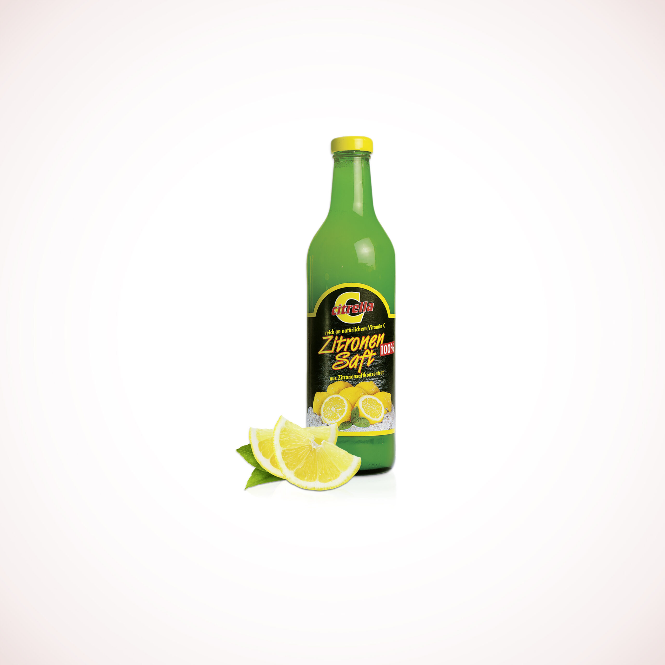
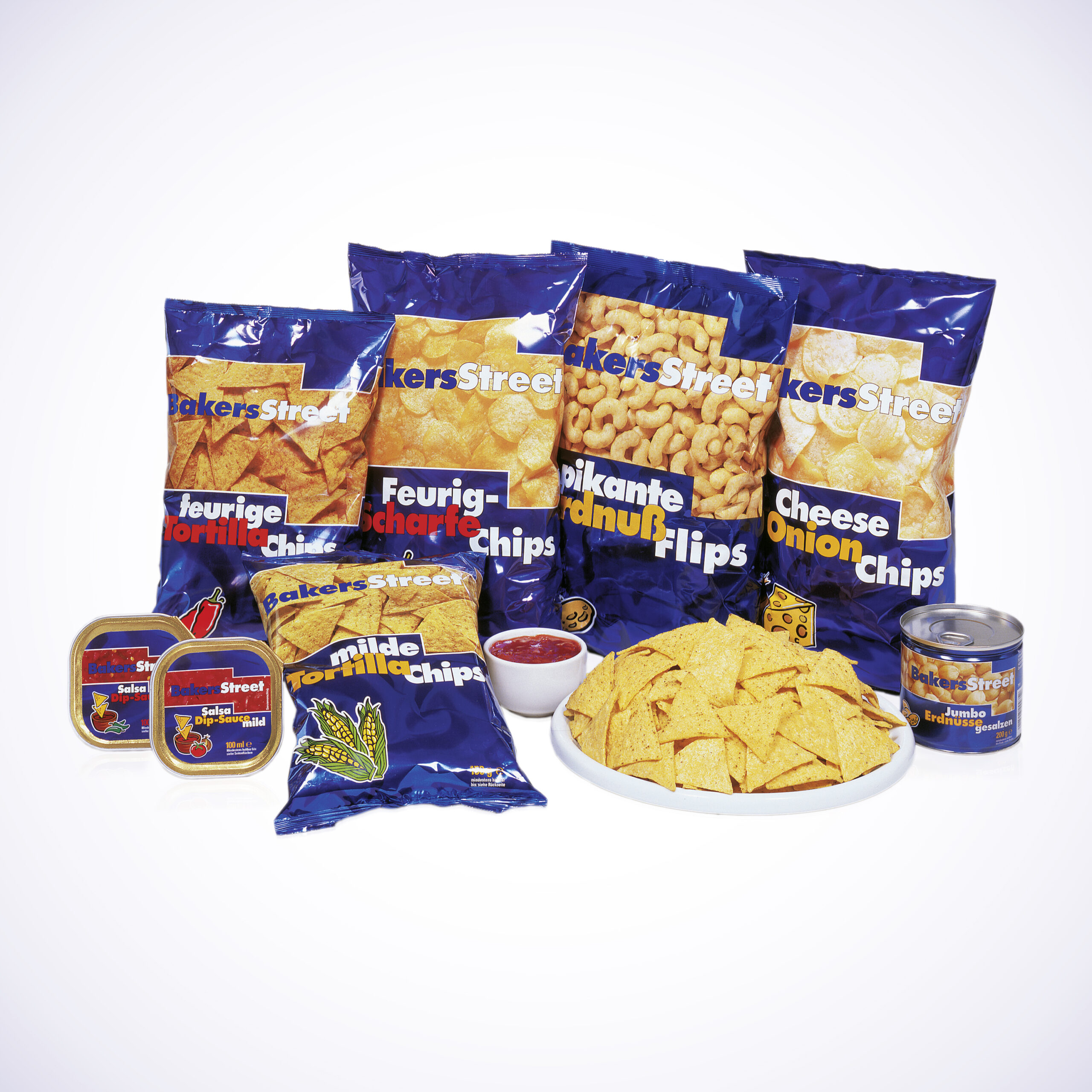
The ‘Schlemmerfix’ brand stands for freeze-dried herbs and ready-made sauces. The task of packaging design is to highlight the differences between individual products. The quality of the products is enhanced by professional food photographs and tasty serving suggestions.
